

Type Walk—Type Draw
Ligatures’ first Summer School [workshop] bridges Heritage Preservation and Design Innovation
The two-day workshop led by Diogo Rapazote captured the soul of the city’s vanishing lettering and typography—and sparked a sense of wonder and historical preservation mission with the participants.
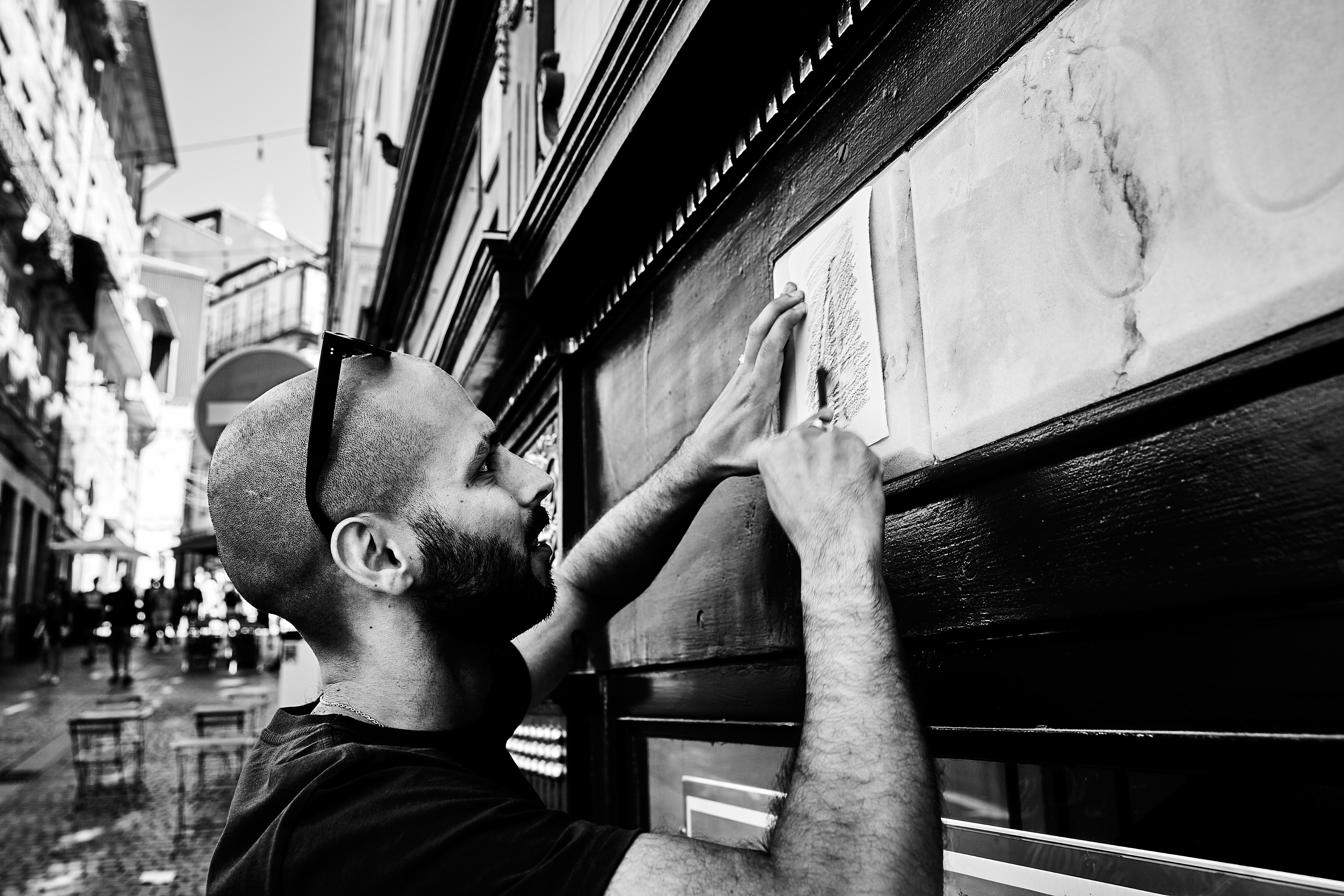
Under the sweltering July sun, 18 designers, students, and researchers fanned out across Porto’s labyrinthine streets, their eyes trained on the cracks, curves, and fading strokes of the city’s ungentrified letterforms. Armed with sketchbooks, mobile phones, tablets, and a mission to research and discover Porto’s city letterforms, the inaugural Type Walk—Type Draw workshop—hosted by the Ligatures Special Interest group from the i2ADS and ID+ research units of the University of Porto—transformed the urban landscape into a living classroom.
Moving from seeing to drawing to designing on the computer, by the end of Day 2, participants had not only resurrected forgotten material letterforms but printed their own bold visions onto posters and T-shirts, proving that Porto’s cultural DNA is still etched in its streets.
Diogo Rapazote: The Art of Imperfection
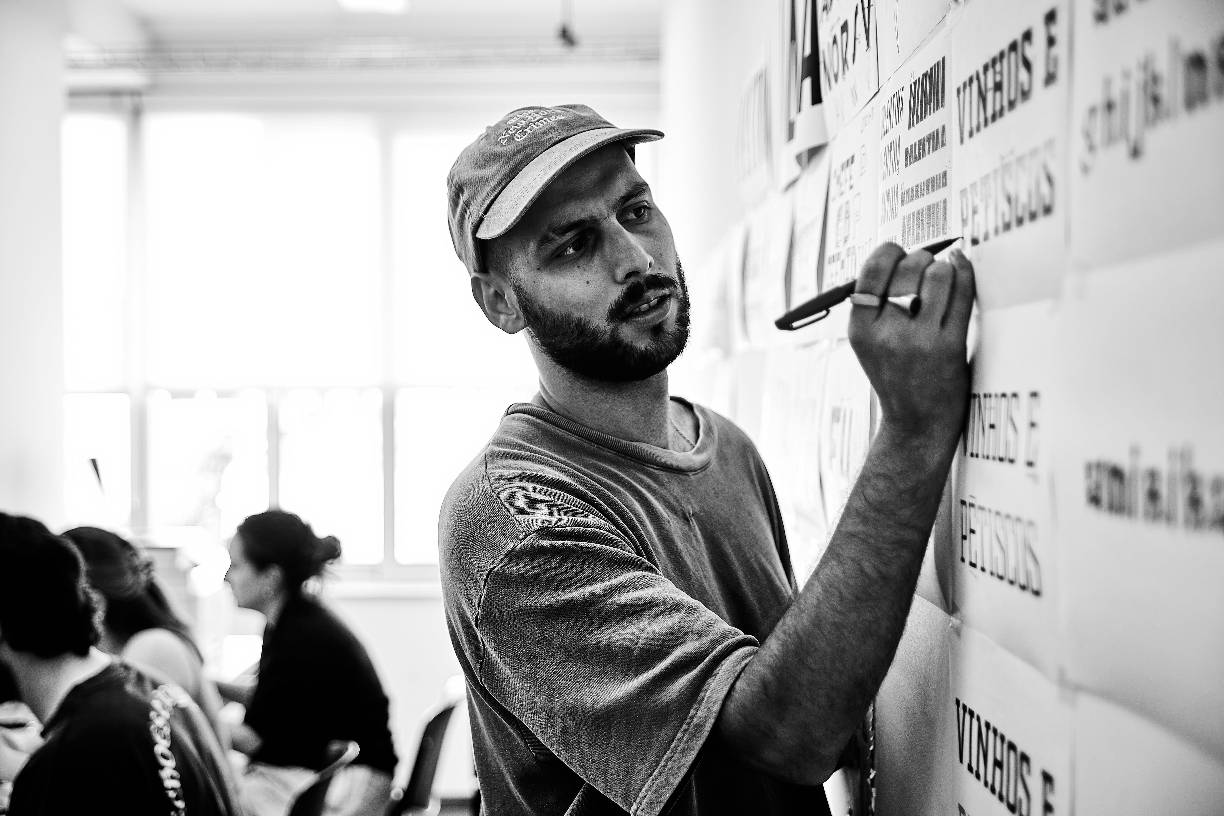
Rapazote, a self-taught type designer, ever curious and willing to learn and share his learnings with the community,, championed experimentation over technical dogma. “Porto’s letters aren’t pristine—they’re layers of history,” he remarked, urging participants to embrace the “noise” of hand-drawn imperfections. His anecdotes from Dalton Maag—where collaboration often trumped precision—resonated as students wrestled with variable fonts. One breakthrough moment? A critique session where Rapazote dissected the “variable cube” theory, showing how a single glyph could morph across weight, width, and optical axes.
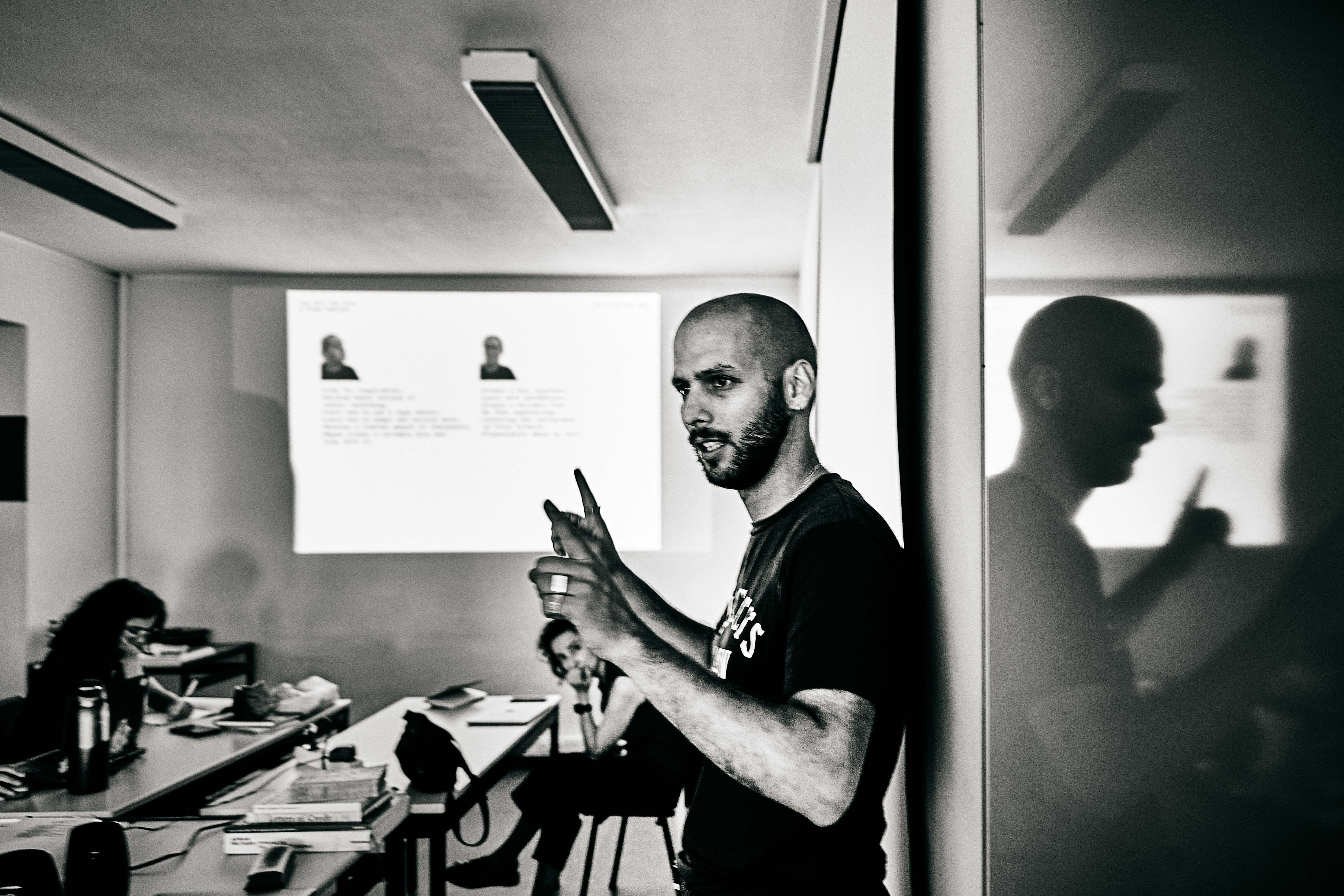
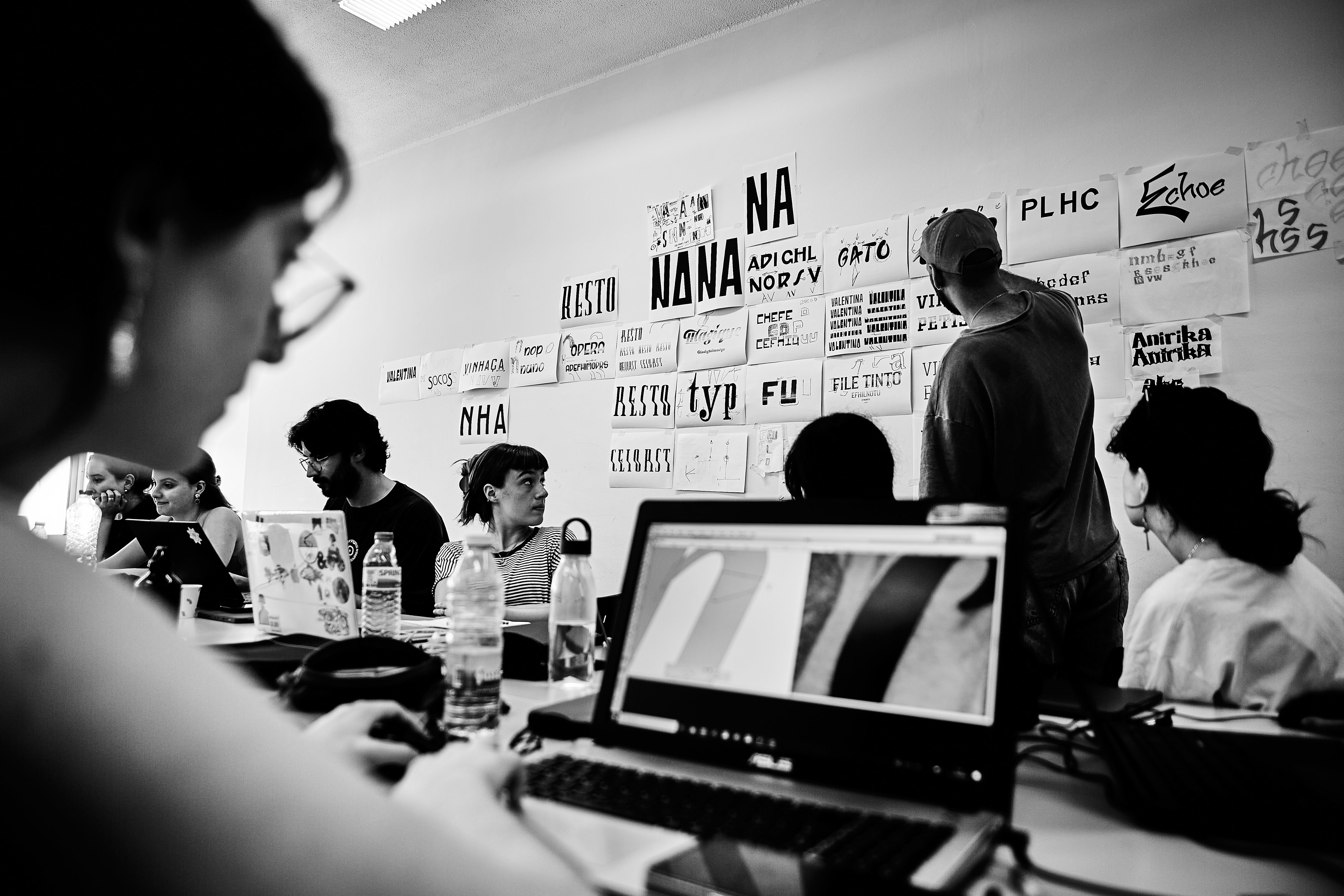
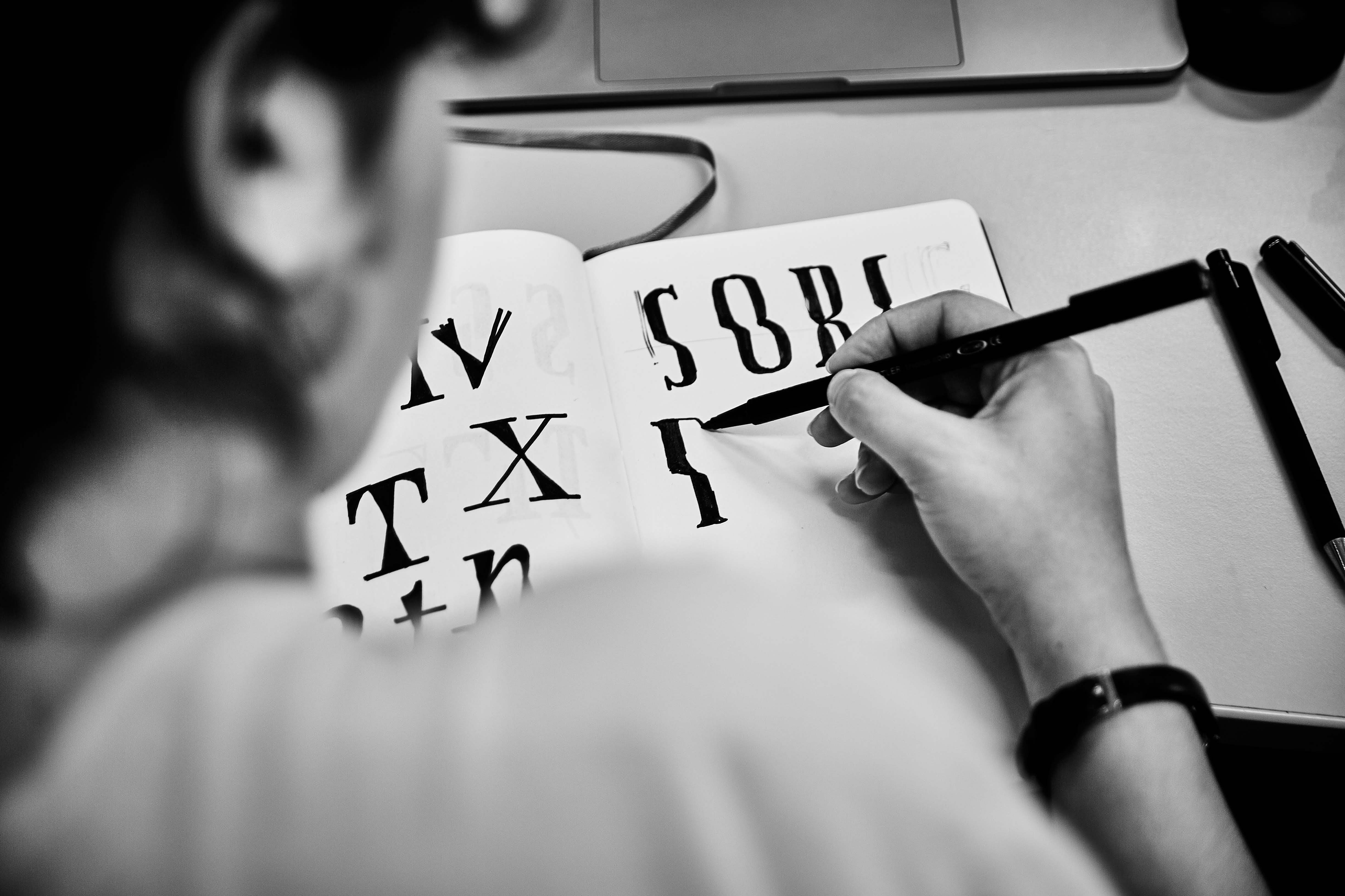
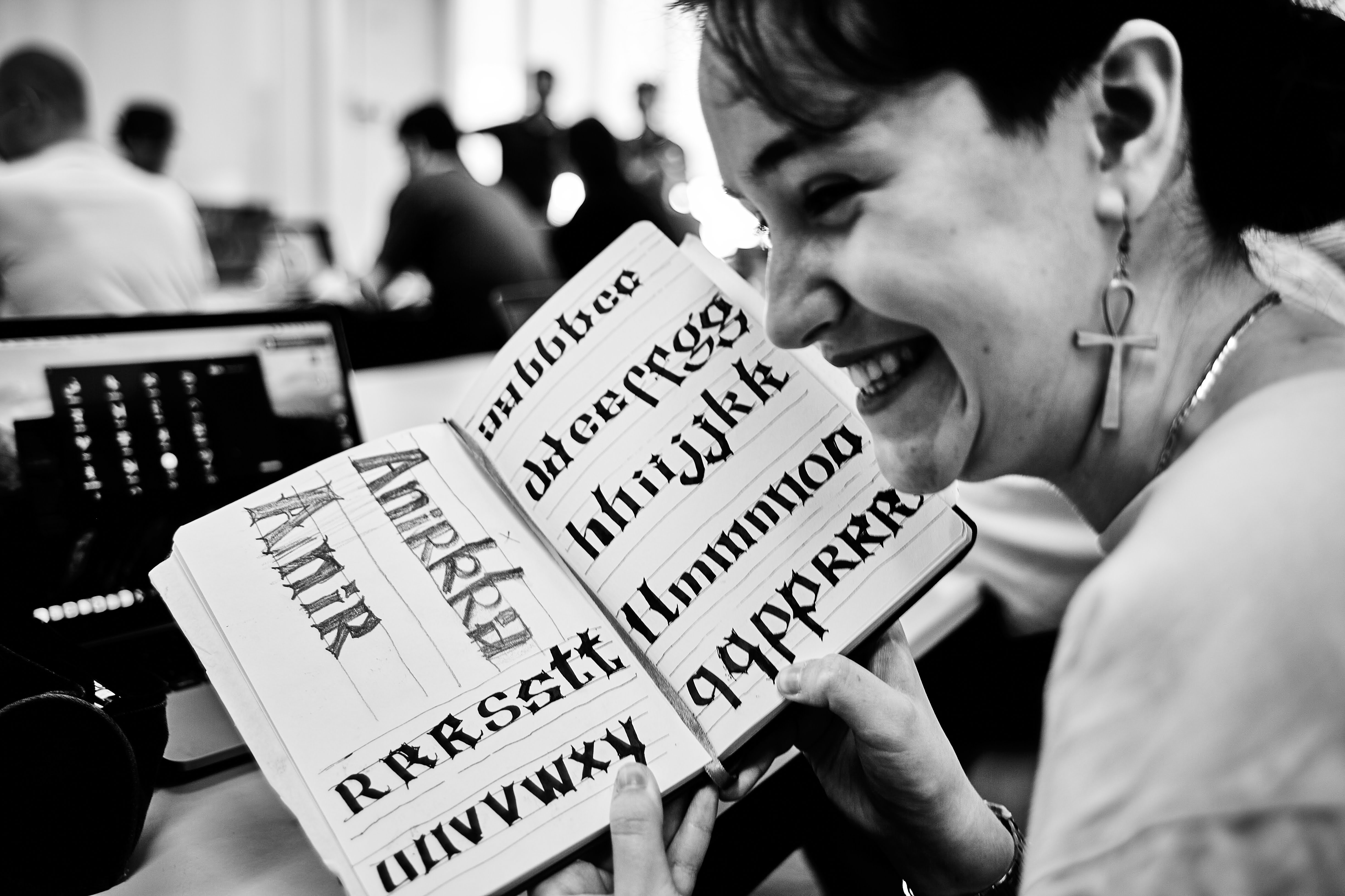
The workshop’s first day, Type Walk, retraced a path blazed by Diogo Rapazote during the 2019 Fontstand Conference. This time, the goal was urgent: to document shop signs, graffiti, and architectural letterings at risk of vanishing beneath Porto’s rapid gentrification. Participants scavenged the city like forensic designers, using frottage (rubbing stone-carved letters), mobile photography, and sketches to capture the raw, pre-tourism aesthetic of neighborhoods like Baixa. “We looked at everything—statues, cobblestones, even the sky,” said one organizer. The afternoon shifted to the classroom, where Rapazote introduced Gerrit Noordzij’s stroke theory, guiding participants to reinterpret their sketches through a “fill mode” technique, building letterforms from memory and visual fragments. Analog tools dominated—Bush pencils, ink, and paper—though iPads flickered among the sketchbooks.
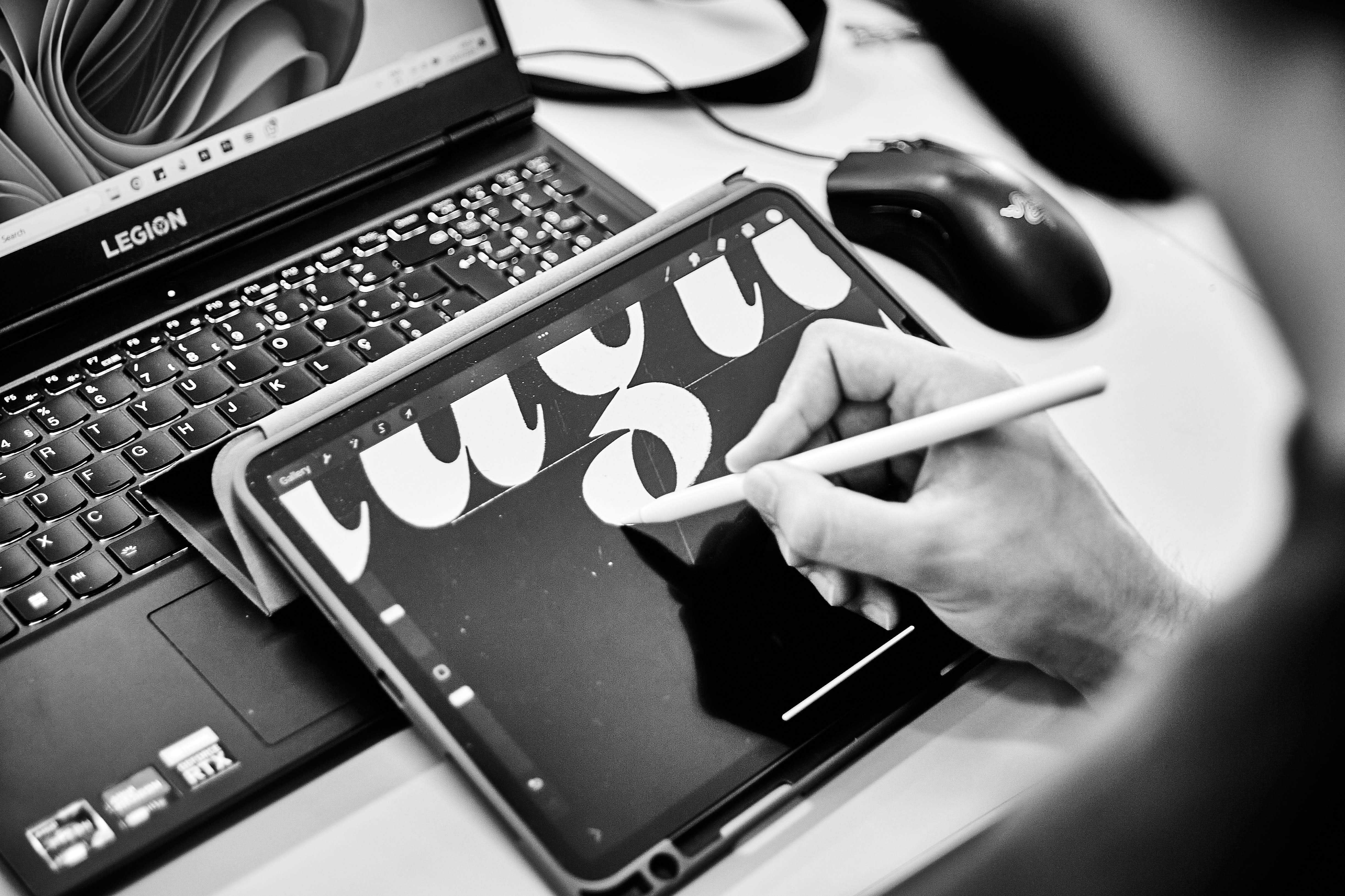
The day was not over until we had a first taste of the digital software Glyphs App. Participants drew their first shapes — though most of them had already dabbed in lettering and font development before.
From Street to Screen: The Digital Alchemy
Day 2, Type Draw, plunged deeply into the digital realm. Rapazote continued to demystify Glyphs (and we also covered FontLab partially), tools he honed during his tenure at Dalton Maag.
Participants transformed the previous day's analog and digital sketches into variable fonts (albeit just a few words at the time), sprint-testing designs on a laser printer and pinning iterations to the wall for rapid-fire critiques. The brief? Design a meaningful word that resonated with Porto’s identity.
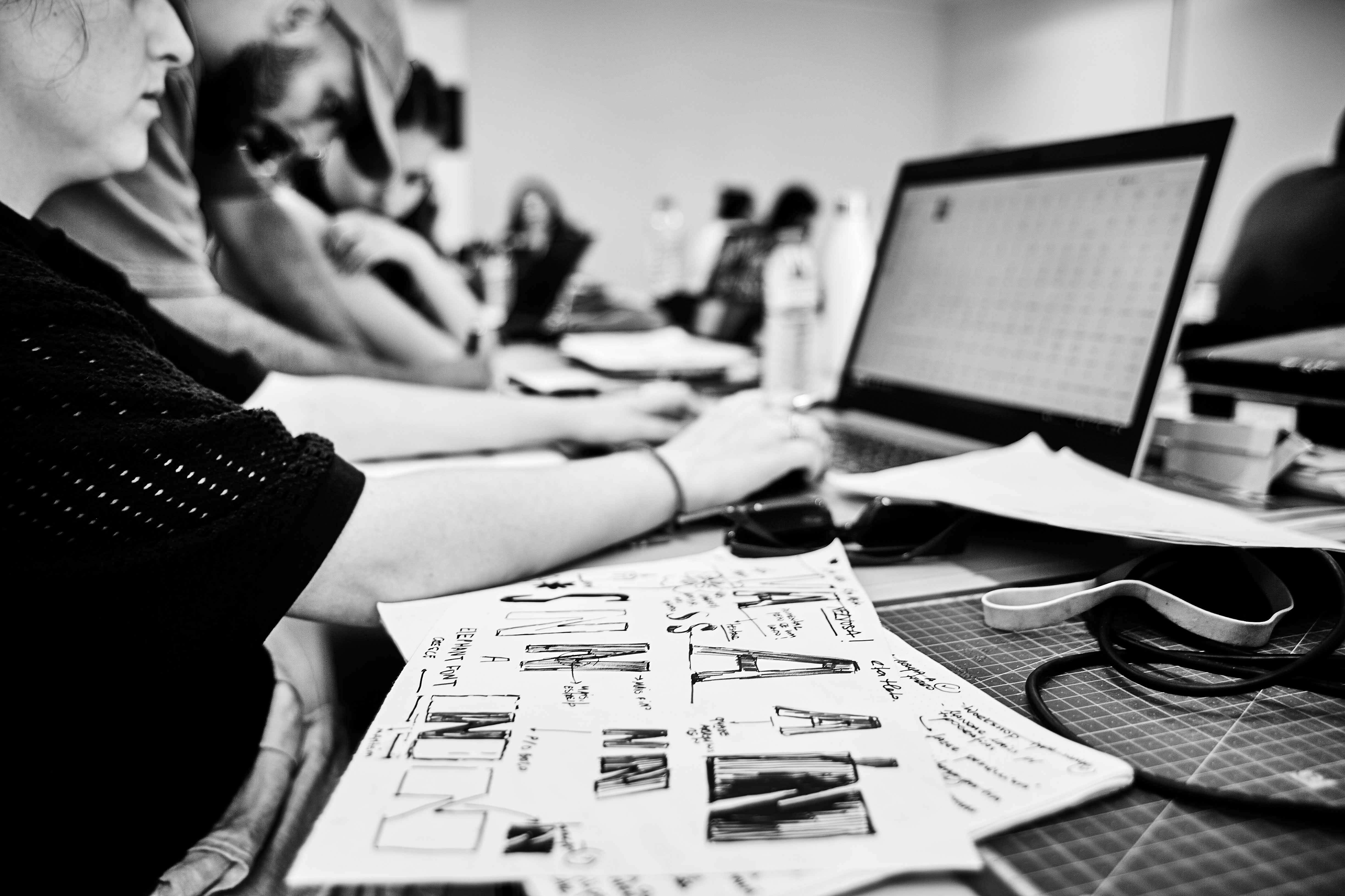
Some of them developed full character sets (eg. uppercase). But a special mention for Valentina — the work of Rita Melo — a multi-axis variable design inspired by vernacular neon signs in a shop window, it later was [is being] developed into a full character set variable typeface and has even evolved into a 3D Letterpress Type fount—a hybrid artifact bridging past and future — being tested in the printmaking workshop of FBAUP as we write these words.
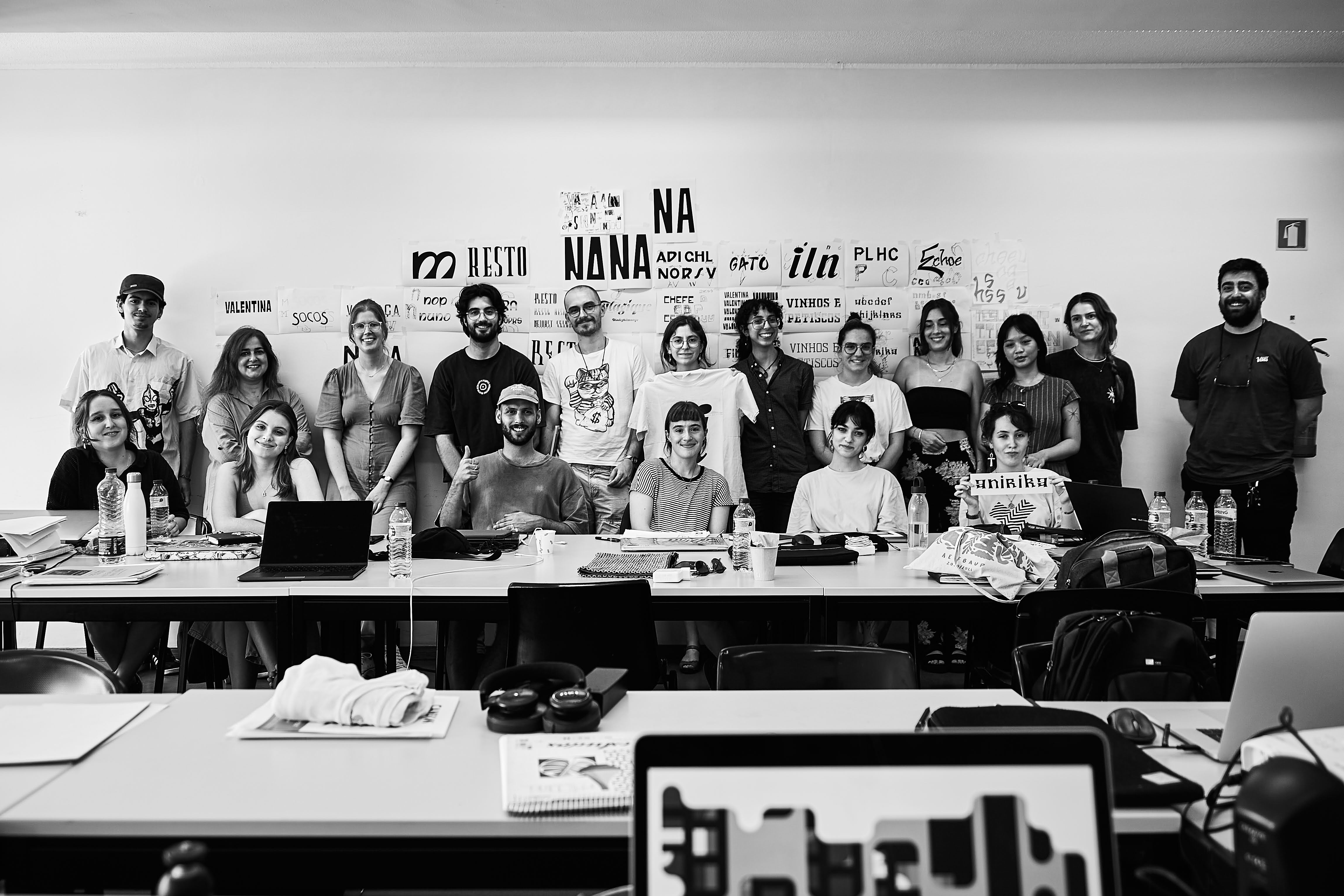
But, resuming our main topic — by dusk, every participant had screen-printed their word onto T-shirts, wearable testaments to Porto’s typographic spirit.
Urgency in Preservation: Voices from the Workshop
The 18 participants—a mix of University of Porto Master’s and Bachelor design students, an ESAD Master student, a professional Architect, and a Professor and PhD candidate from Coimbra—shared a common refrain: gentrification is erasing the city’s visual heritage. “I never noticed how much these letters tell our story until they tasked us with saving them,” reflected one attendee. Ligatures members Vítor Quelhas and Catarina Silva emphasized the workshop’s role in the research Unit’s social and design mission, in which initiatives such as the NIT or Ligatures group are spearheading historical preservation through design. Though a couple of grant applications to expand this work have remained unfunded to date (a third one is still waiting for the results), the event has already catalyzed plans for future workshops on computational letterpress and Python-driven type design.
Looking Ahead: The Future of Ligatures
Deemed a “proof of concept” by organizers, this experimental edition has cemented plans for a 2025 sequel. The next workshop will expand to include international speakers, junior researcher panels, and social activities to deepen interdisciplinary bonds. As tourism reshapes Porto, Ligatures’ call to action grows louder: Letters are not just shapes—they’re the fingerprints of a city’s soul.
Call-to-Action
Don’t miss the upcoming conference by the Carvalho-Bernau Design Studio—details to be announced soon! And mark your calendars for the 2025 edition of Type Walk—Type Draw. Whether you’re a designer, researcher, or typography enthusiast, join us in preserving Porto’s visual heritage while shaping its future.
Aknowledgements: this text was generated and heavily edited with the assistance of Deepseek R1 (March 2025 version), in Google Docs with Grammarly revision.